Whether you are thinking about a modern web design for your 2007 e-commerce website or getting ready to start designing and developing a new one, there is a lot to consider if you want your website to take you places.
How Should I Design My E-Commerce Website?
There are quite a few ways to layout an e-commerce website, but no matter what format you decide on there are a few important details to pay attention to. First, your site has to have a sophisticated and professional look if you think people are going to enter their payment information toward the bottom of your marketing funnel. Second, your site has to be simple and intuitive. Users should not even have to think about the process of finding an item they will buy, adding it to their cart, and checking out.
What Does Marketing Have To Do With E-Commerce?
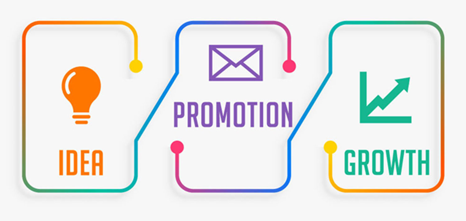
Marketing has everything to do with an e-commerce site. You don’t necessarily have a sign on the street, or in the mall, telling potential customers what your deal of the day is. The sales process is sensibly thought of as a funnel, and that means you want the top of your funnel to be wide, far reaching, easy to find, and attractive.
If you want to handle some of your own marketing, your success will be directly proportional to three things: the amount of time you want to invest, your budget, and your understanding of how to invest your budget. The reality is that for a mid to large sized company it is best, by far, to outsource this work. Even if you have a good understanding of the best marketing routes, it comes down to a matter of time. Share your marketing ideas with an experienced company who can make a better use of your time and resources. A static digital marketing campaign will never be the best. You have to discover what’s new, what’s working, and what’s not working – and then you have to adapt to the everchanging marketplace.
How Can I Make An E-Commerce Website A Success?
On a macro level, the success of an e-commerce site is going to come down three things: bringing users to the site, making a sale to a good percentage of those users, and having those same users return to buy something else. On a micro level, these are all intricate, dynamic, and developing processes.
The most complex of these three things is the first one. Bringing users to your site. That is because there are not, nor should there be, two marketing campaigns that are the same. From search engine optimization and pay-per-click to more traditional strategies, there is a lot of research and adaptation to be done.
Let’s talk about landing a sale with a good percentage of your users. It will come down to design first, and the products or services you are providing second. Period. The DMV does not care a whole lot about user experience, because there is only one place to do your DMV business. There is no competition. However, on the internet there is plenty of competition. Now, people will buy anything if you make the right pitch. They buy worthless widgets online all the time. On the other hand, if you land on a site that is less than professional, you will not be very likely to purchase anything – no matter how good the deal sounds. That is because they can buy the same item or service elsewhere. Simple supply-and-demand. What will set you apart from the competition?
Once someone has made a purchase, the best way to get them to return to your site, is to bring them back with a few of their friends in tow. Word of mouth, baby. In the age of instant communication and social media – nothing will make or break you like word of mouth. So how do we do we get people to return with a friend? Each product or service is unique, but some examples are referral promos, discounts on the purchase of multiple products, etc.


