
One of the most prevalent topics in the field of web development is ‘responsive design’… even though it should be called ‘responsive web development’. More on that later. Since people began incorporating different size devices into their daily internet-surfing lives, it has become a hot topic of discussion. It is now a standard feature that your website will display correctly on all devices. From desktops and laptops to smartphones and tablets – basically any device that can access the internet. But, if you’re unfamiliar with the subject, you’re likely to have at least a few questions. But no worries, we will try to answer them all here in this article.
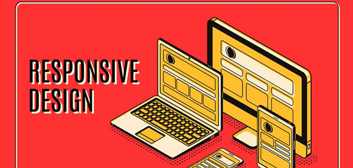
What Is Responsive Design?
Well, responsive design is a website that simply fits on the screen, regardless of the platform. The resolution of the device on which the website is being viewed is determined using media queries. A media query is when the CSS of the website asks the device it is being displayed on “How big are you, device?”. And then a set of styling will take effect once the device answers with its size.
Why Should We Use Responsive Design?
I’ve heard a lot of people wonder, “why use responsive design?” The most straightforward answer is that if you display your content the same way on a phone as you do on a laptop, you will be kissing your good user experience goodbye. It all kind of leads back to the old adage that “it’s not what you say, but how you say it.” This is where responsive design comes in handy. Let me point out the benefits of using responsive designs:
- User Friendly: This is one of the main features offered by a responsive design. It is well known that if your users have a good experience absorbing the information on your website, they are much more likely to do things such as follow links to other pages on your site, buy your product, return to your website, or recommend your website to a friend.
- Easy-Access Using Various Platforms: People are increasingly reliant on smartphones and tablets to access websites. So responsive design gives you the privilege of the same user experience regardless of the device you are using. As a matter of fact it is recommended by Google that you do what is called a “mobile first” design. This means that by default, your site is designed for a phone, not a desktop. The reasoning goes something like this: more people use the internet on phones, by a quickly growing margin, and that your site shouldn’t have to be restyled for the most commonly used devices. Also, restyling a website design takes time and resources, which can be scarce on a mobile device because they tend to have slower internet than a desktop..
- Minimal Work: We all know by now that responsive designs use only one website. So, you just have to update the data on your website once. There’s also no need to keep different websites for desktops and handheld devices. The lack of separate versions reduces the amount of time and effort required to create and maintain your websites.
- SEO-Based: Search engines provide competitive edges to those with a responsively designed website. This is because they tend to look for more user-friendly websites. Hence, you can improve the SEO of your website by ensuring the design is responsive. There are two main reasons for this: search engines want to send people to websites that they will like to visit, and the quick and reliable nature of the mobile first website development conventions.
Which Is Better, Responsive, Or Adaptive Design?
I don’t think we can say who the winner is in this case. First and foremost, we must remember the audience. This will inform you of the best design methodology to use. It’s easier to build with them in mind when it comes to layout, material, and so on because you know who they are and what devices they use to access the web.
Many websites are built using responsive design, and it has become the mainstream design process. In light of this, we can conclude that responsive design is the best option.
However, if you have to keep to a budget, then you should go for the adaptive design method. They give users a theme-based site that varies depending on the device they use to browse it. They also offer advanced configuration methods to help you speed up the process even further.
How Will A Responsive Design Affect The Budget?
This is where it becomes very relevant whether we are talking responsive website design or responsive website development. See, you have to pay a developer to spend their time making sure your site looks exceptional on every type of device. It is a process that is not automated very well at all. Responsive design requires more time because of the process of trial and error, and web developers charge a lot of money for their time.
Large Websites Need To Be Responsive The Most
The more data you are trying to show, the better it has to be formatted. You would be able to struggle your way through reading a single badly formatted paragraph on your phone, but you would get a headache trying to read a book like that. So, the more information you are displaying, the more responsive your website will have to be.
What Is The Best Way To Test Responsive Web Design?
To be frank, the only way to see if your responsive web design is working properly is to test it on real devices. This is, by far, the simplest and most effective form. Although there are a few browsers with developer tools built in that will fairly adequately simulate actual application testing. But you need real devices because of the different platforms. Unfortunately, it is still true that you will have to do some special stuff for Apple devices.
You can always ask your friends and family to test it for you. Send them the URL and ask them to look it up on their computer or mobile device. Request a screenshot of the interface, as well as information about the device they’re using. In this way, you have already completed your trial run on several devices and can collect data on its dependability.
Most importantly, you should conduct your investigation. Examine the website’s usability and design flow so that you can make changes based on your own judgment. You’ve got to trust yourself!
Conclusion
The big 3 ingredients for a responsive web design are adjusting tables and grids, flexible images, and media queries. It really all comes down to CSS. Given each device’s dimensions, your CSS will either change, show, or hide elements to some devices. That’s right, you may see significantly different content on a desktop than you would on a phone. But in truth, you will have to show the most important stuff to everyone.